Gendered Design Conventions in PHI
Role: User Experience Designer & Researcher
Timeline: Fall 2024 (Aug – Dec)
Skills & Methods: Speculative Design, Critical UX, Interaction Design, Qualitative Content Analysis, Interface Reverse-Mockups
Artifacts Generated: 20-App Comparative Matrix, High-Fidelity Design Prototypes (Romeo & Valor), CHI-style Academic Paper
Overview
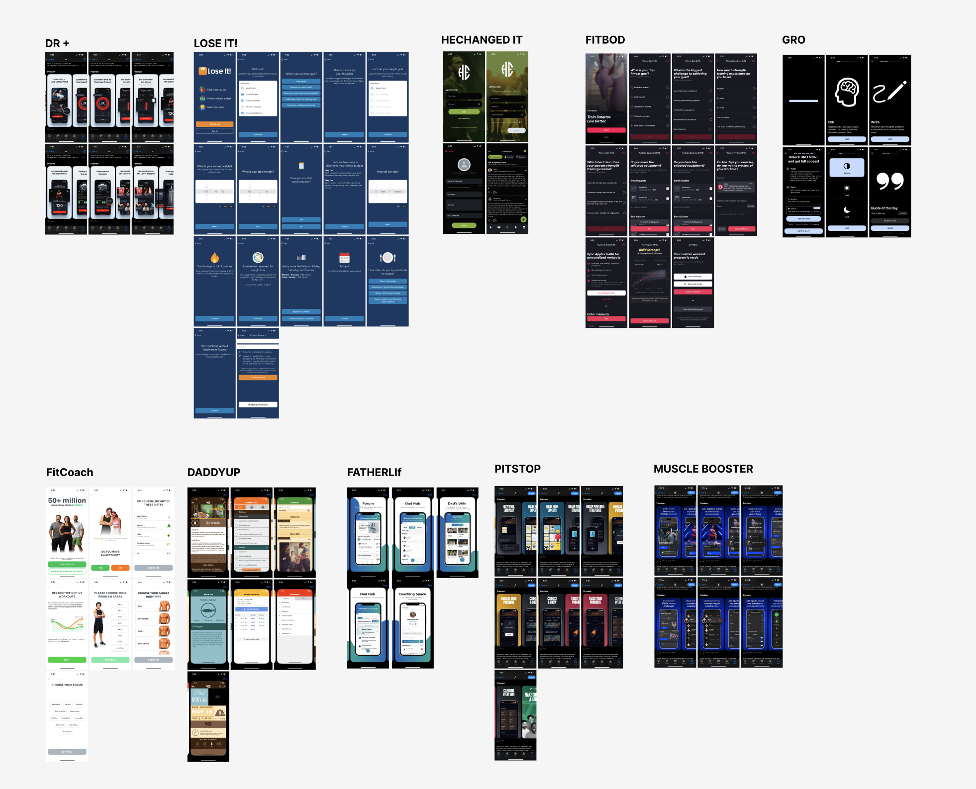
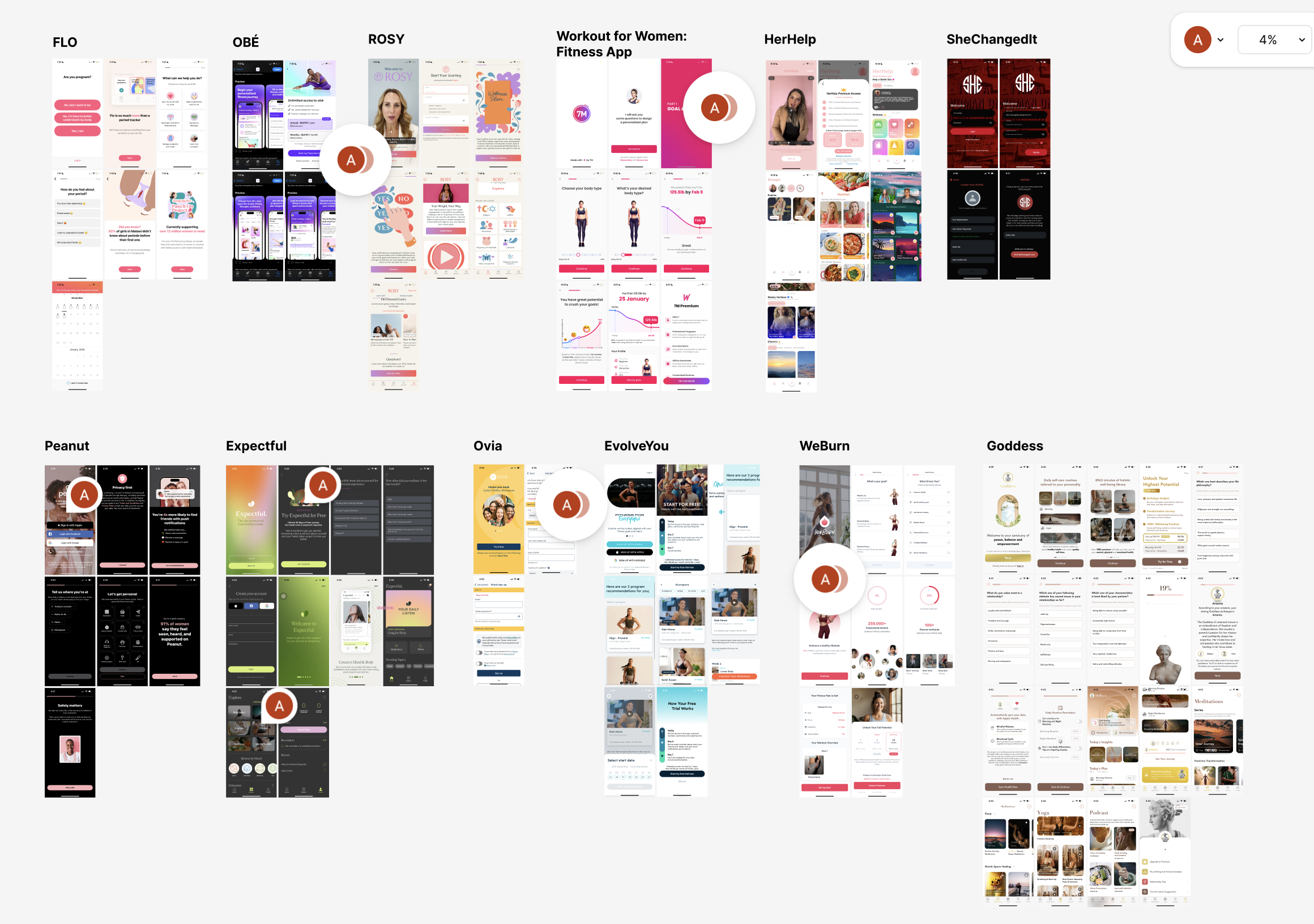
Health app users and product teams were stuck with heavily gendered interfaces that trivialized women's health and turned men's apps into aggressive gym trackers. To challenge this, I analyzed 20 top App Store wellness apps and built two speculative, role-reversed mobile prototypes (Romeo and Valor). The project showed how neutral, data-first design exposes hidden bias and keeps health tracking focused on accurate information rather than shallow stereotypes.
Tension
Most personal health apps rely on outdated stereotypes. In daily use, women tracking pain, fertility, or cycle trends are often met with pastel pink themes, floral graphics, and bubbly copy. This playful aesthetic downplays serious medical events like cramps, nausea, and heavy bleeding. At the same time, apps marketed to men hide basic wellness, parenting, and emotional support behind dark, "finance-bro" dashboards focused almost entirely on muscle building.
This divide creates real problems. It alienates nonbinary and trans users, pushes fathers out of parenting tools (where 0% of top App Store parenting apps were designed for men), and risks doctors taking patient-logged data less seriously because it looks like a decorative journal instead of health record data.
"If women's health data is covered in flowers, doctors don't take it seriously. And when men's apps look like stock trading terminals, men are conditioned to disguise their vulnerabilities behind a high-performance facade."
— Research Synthesis Note
Design
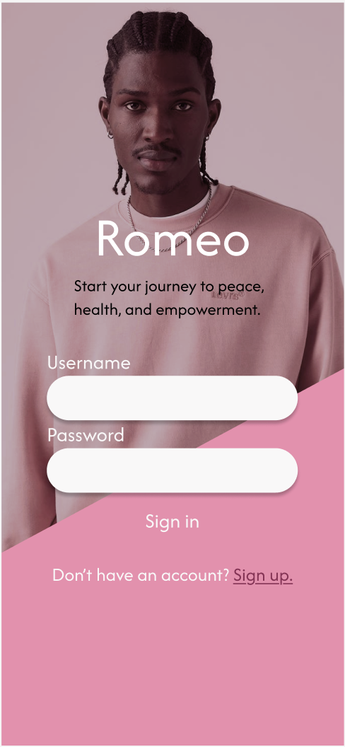
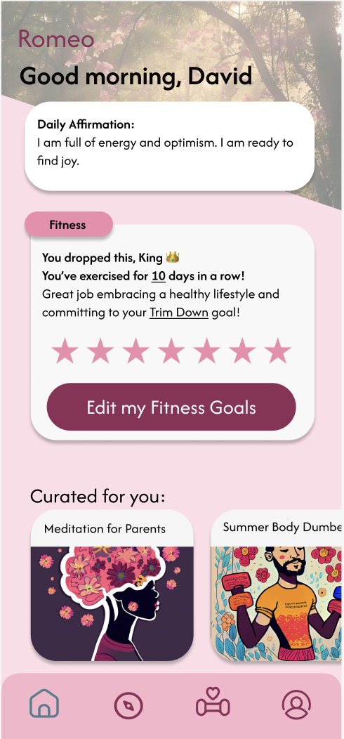
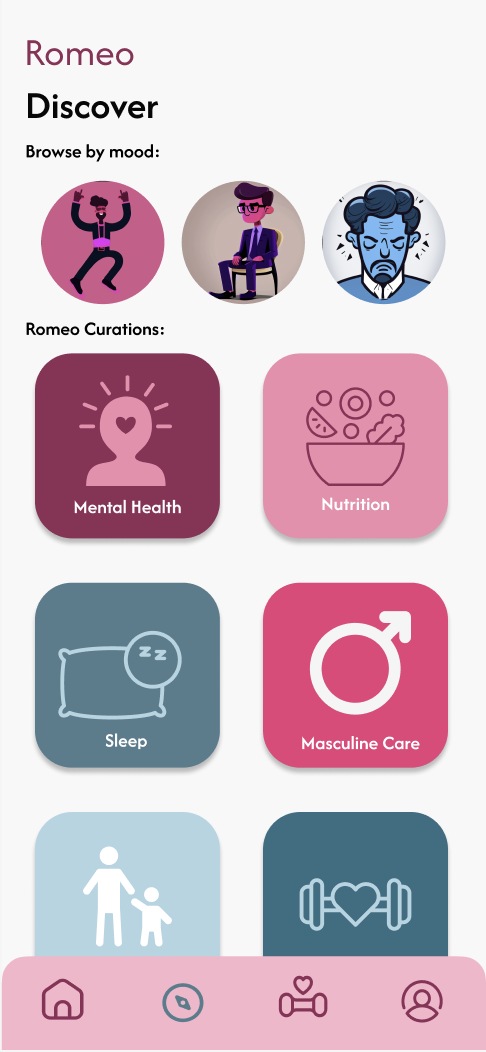
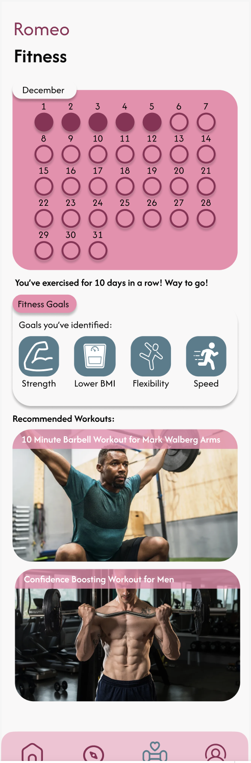
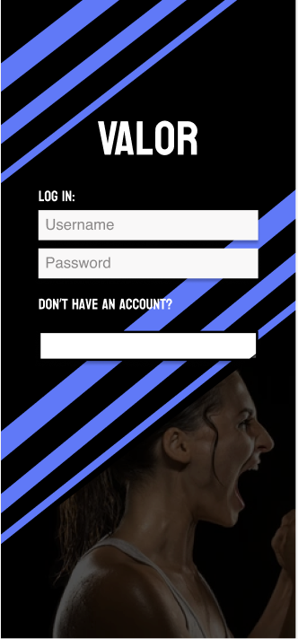
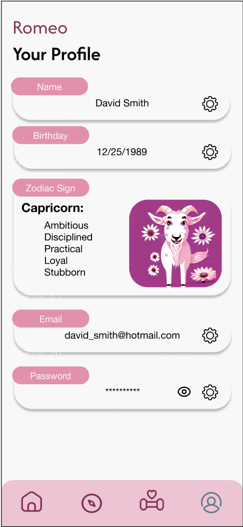
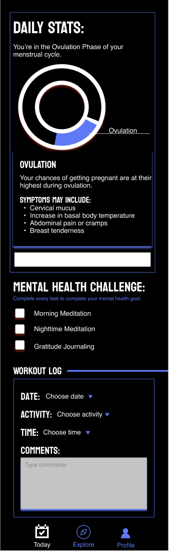
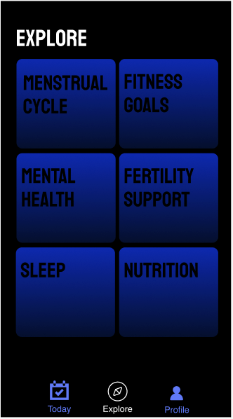
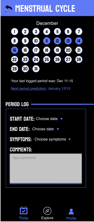
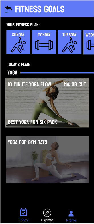
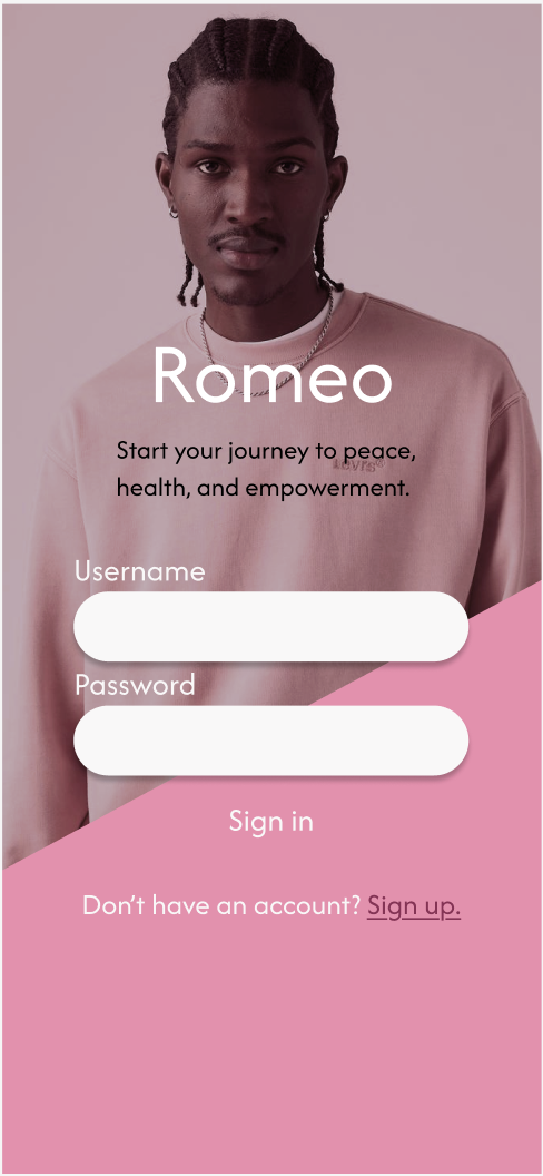
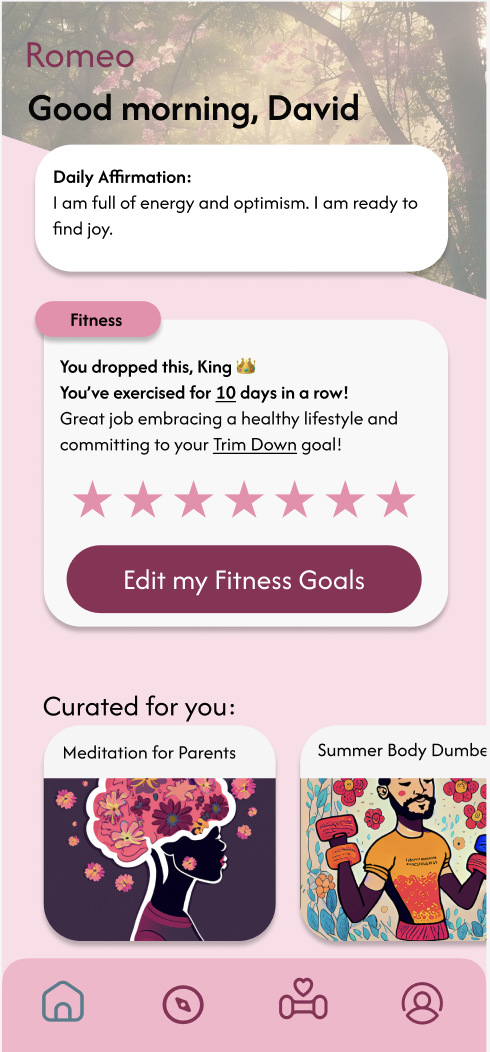
To highlight these biases, I reviewed 20 popular health apps to map their colors, button styles, visual assets, and content framing. Then, I used Figma and Photoshop to build two speculative prototypes that swapped these design rules. For the men’s app, Romeo, I used standard "women's app" patterns: soft pink pill buttons, floral art, daily affirmations, and cheerful messages ("You dropped this, King 👑"). For the women’s app, Valor, I used "men's app" conventions: stark black and blue themes, sharp rectangular cards, bold block fonts, and a clinical ovulation dial paired with a heavy workout log. Both apps kept the exact same core features—calendars, symptom logs, and fitness trackers—to prove that health data is clear and usable without gendered decor.
IMpact
Flipping these visual styles proved that superficial design distorts how we judge health data. When testing user impressions, reviewers viewed the bold, dark-mode menstrual tracker (Valor) as noticeably more "serious" and "clinical." Meanwhile, they saw the pastel men’s app (Romeo) as "warm and supportive" rather than intimidating. By stripping away stereotypes, the project delivered a clear, practical model for building health apps that serve everyone.