IN PROGRESS
ROLE: User Experience Designer / Researcher
TIMELINE: 2025 (Aug - Dec)
SKILLS: Product Design, Interaction Design, Prototyping, User Research
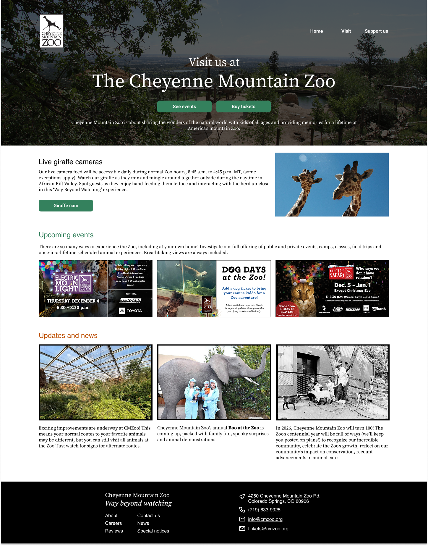
As part of User Experience Design 1 at CU Boulder, I completed a redesign of the Cheyenne Mountain Zoo website in Colorado Springs, CO. The existing site suffers from a complex structure and challenging navigation due to the volume of images and content. My redesign focused on improving usability and visual hierarchy to create a more intuitive, user-centered experience while maintaining the zoo’s engaging and educational character.
I worked independently as the designer and UX researcher. As a designer, I completed low, mid, and high fidelity prototypes in Figma. As a researcher, I conducted five usability tests before the redesign and three between versions 1 and 2 of the high-fidelity prototypes.
Challenge
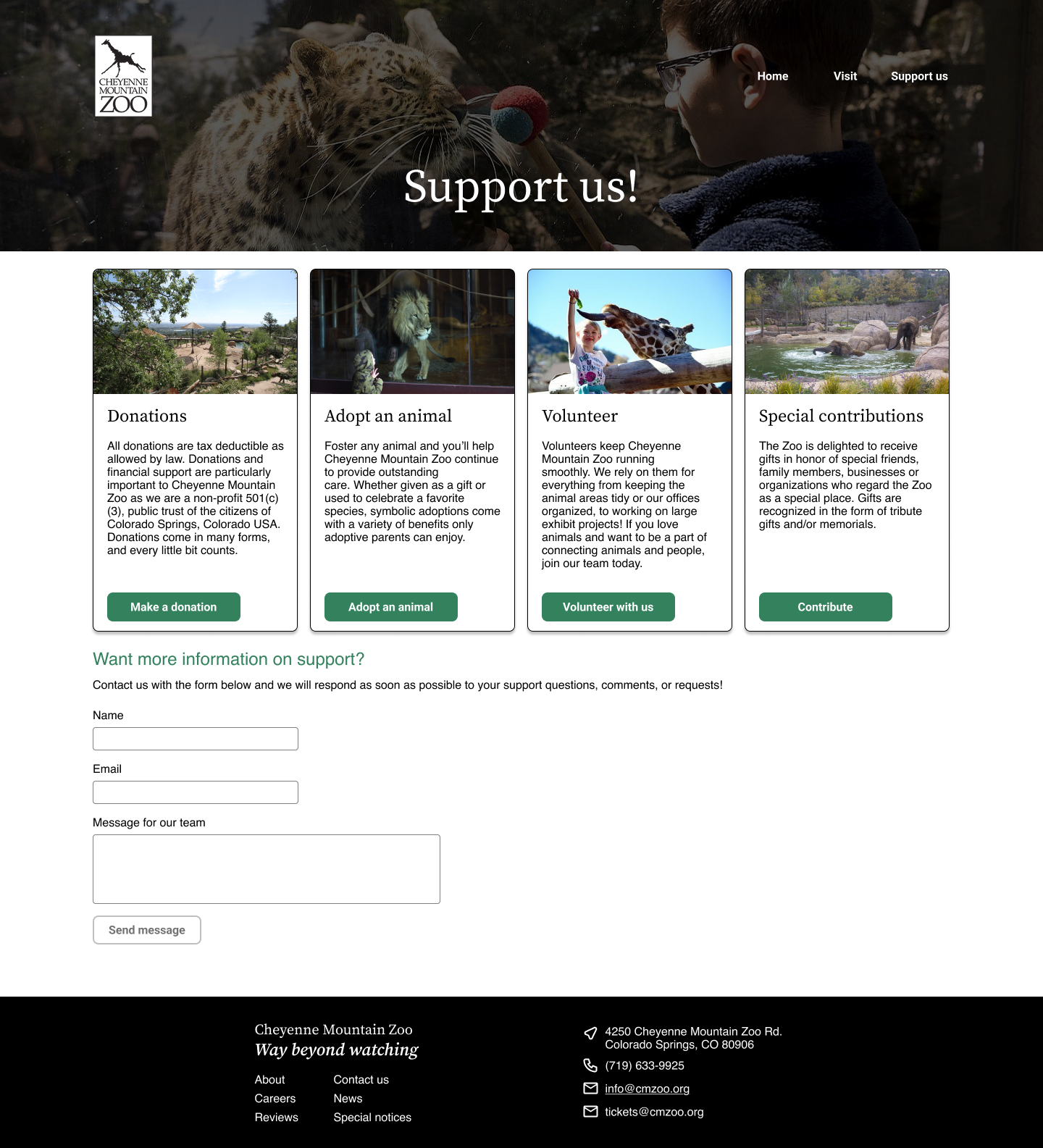
For the Cheyenne Mountain Zoo, I aimed to solve the flow of finding and purchasing tickets to the zoo. The current experience was extremely convoluted and led to many confusing ends. A limitation of this project was designing for the existing conditions for purchasing tickets, including membership types and the varying types of tickets (Adult, child, etc).
Before redesigning, I conducted five usability tests on the current CMZ website design. From this usability testing data, I created affinity maps to understand what users need from the updated website. The largest pain points were the length of the website pages and the time-consuming process of selecting tickets. Users need to be able to find tickets faster and easier.
Research
How Might We… create an updated ticket purchasing experience that easily differentiates CMZ memberships and helps users understand the different zoo events available?
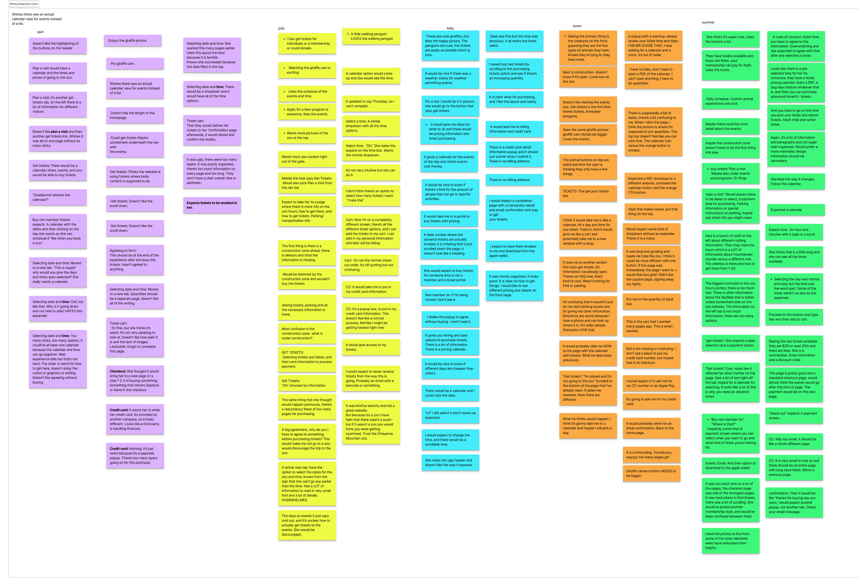
Usability Test Data
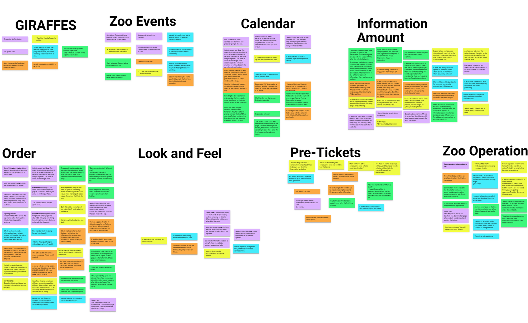
Affinity Maps
Design
Zoo visitors need a simple way to buy tickets because they are unsure of the different types of tickets and events the zoo offers.
PROBLEM STATEMENT

After synthesizing usability testing data, I organized the new flow of the ticket purchasing process. The key was to minimize the amount of pages as much as possible.
TASK FLOW
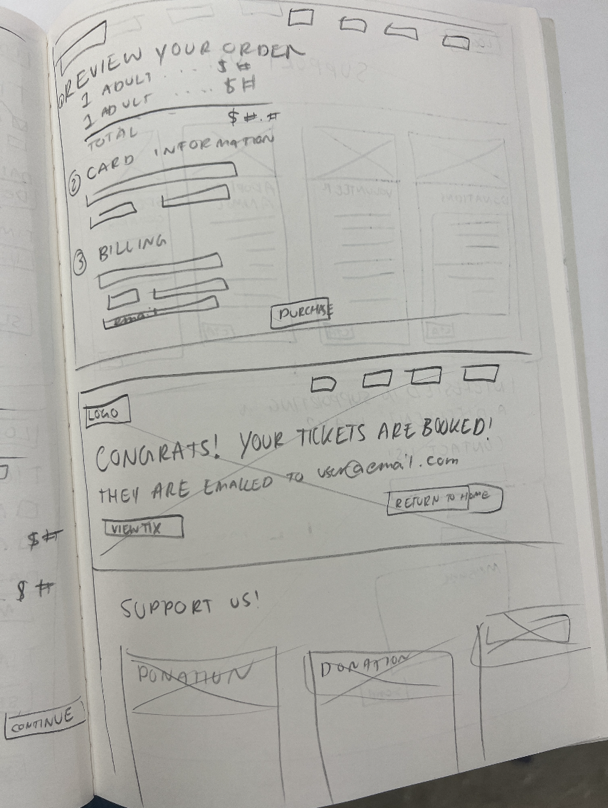
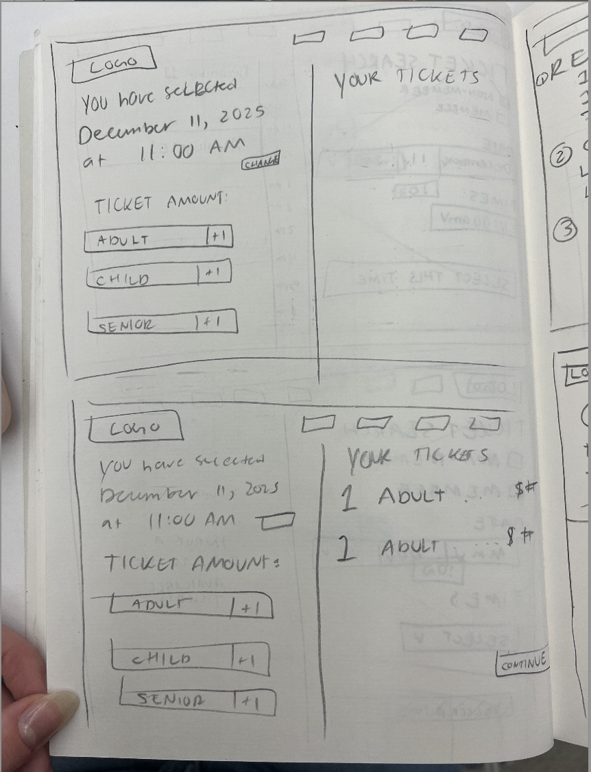
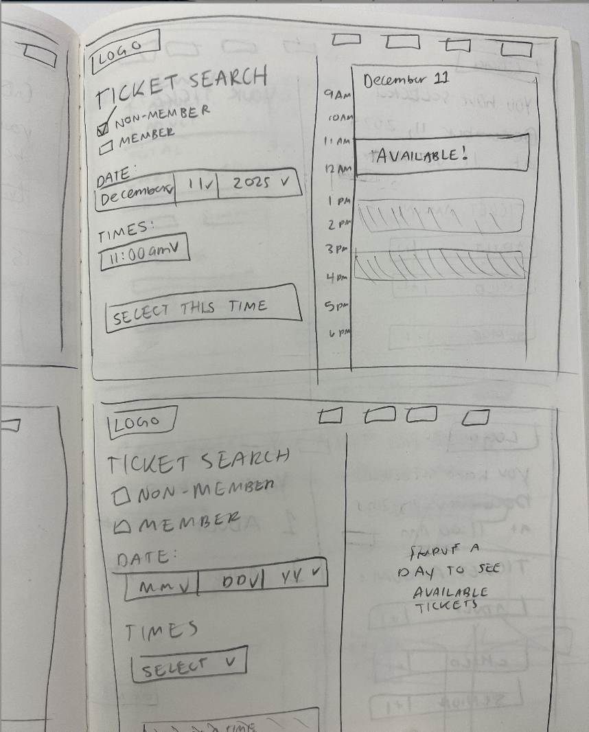
For low fidelity, I used pencil and paper to ideate on the possible design approaches I could take for the ticket purchasing page and the ‘support us’ page. I attempted to consolidate the number of pages to one for each process.
Low Fidelity
Mid Fidelity
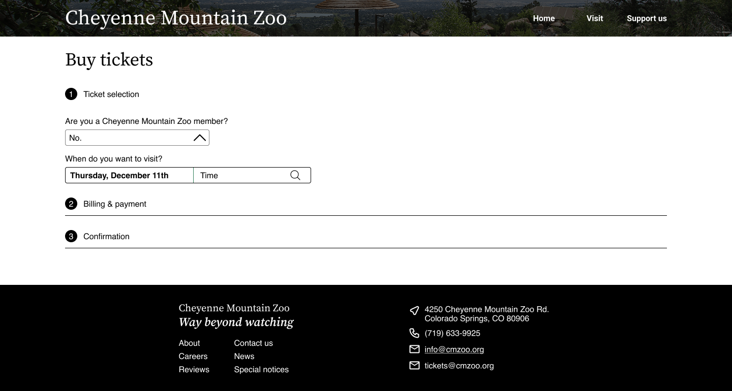
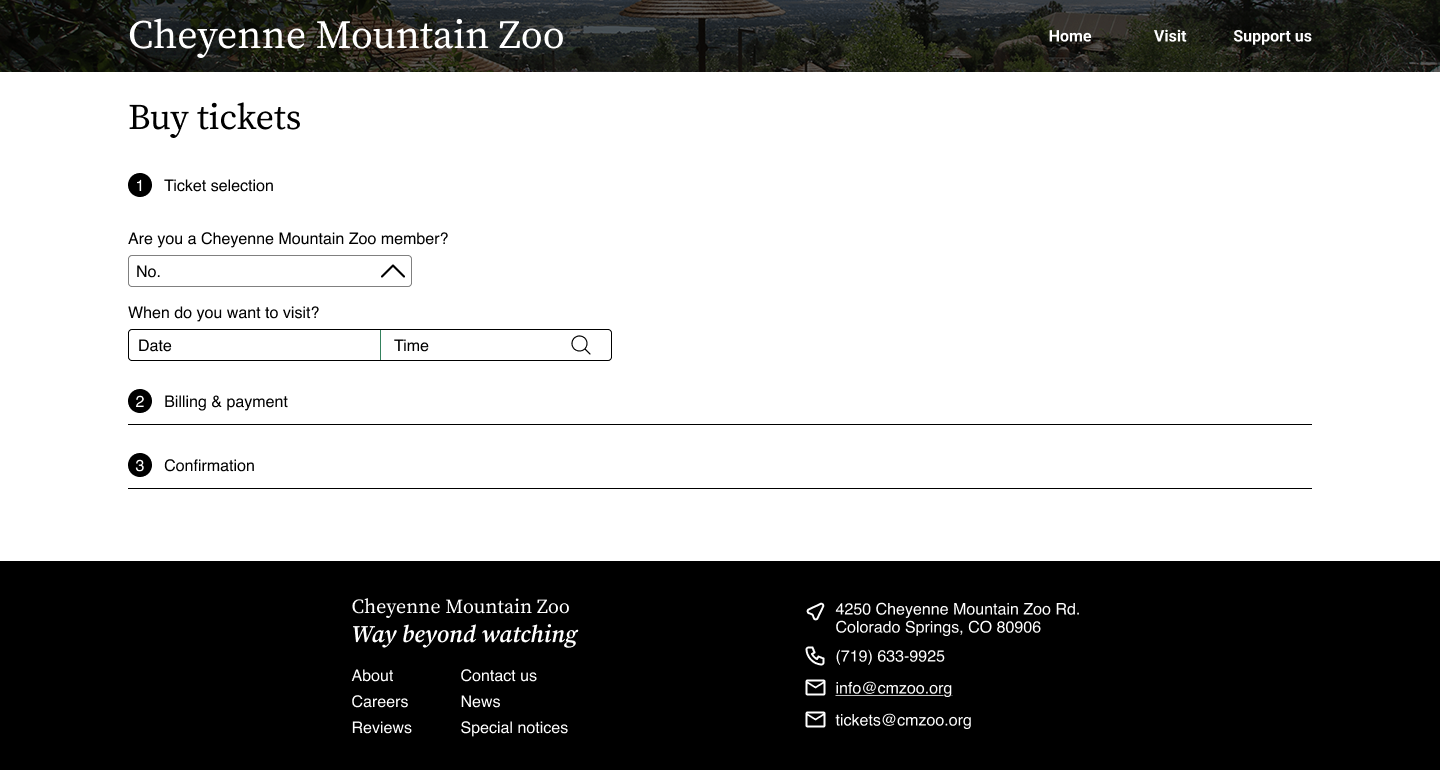
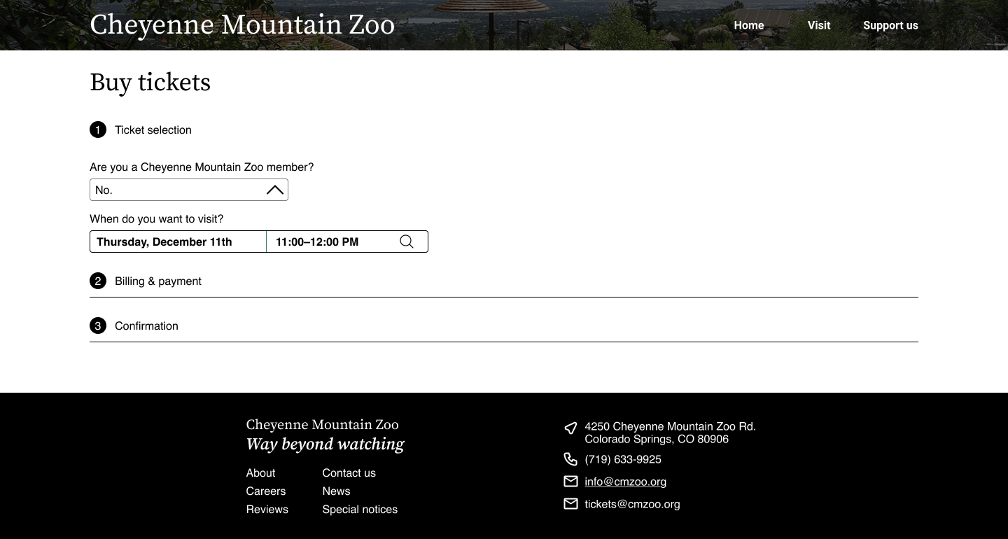
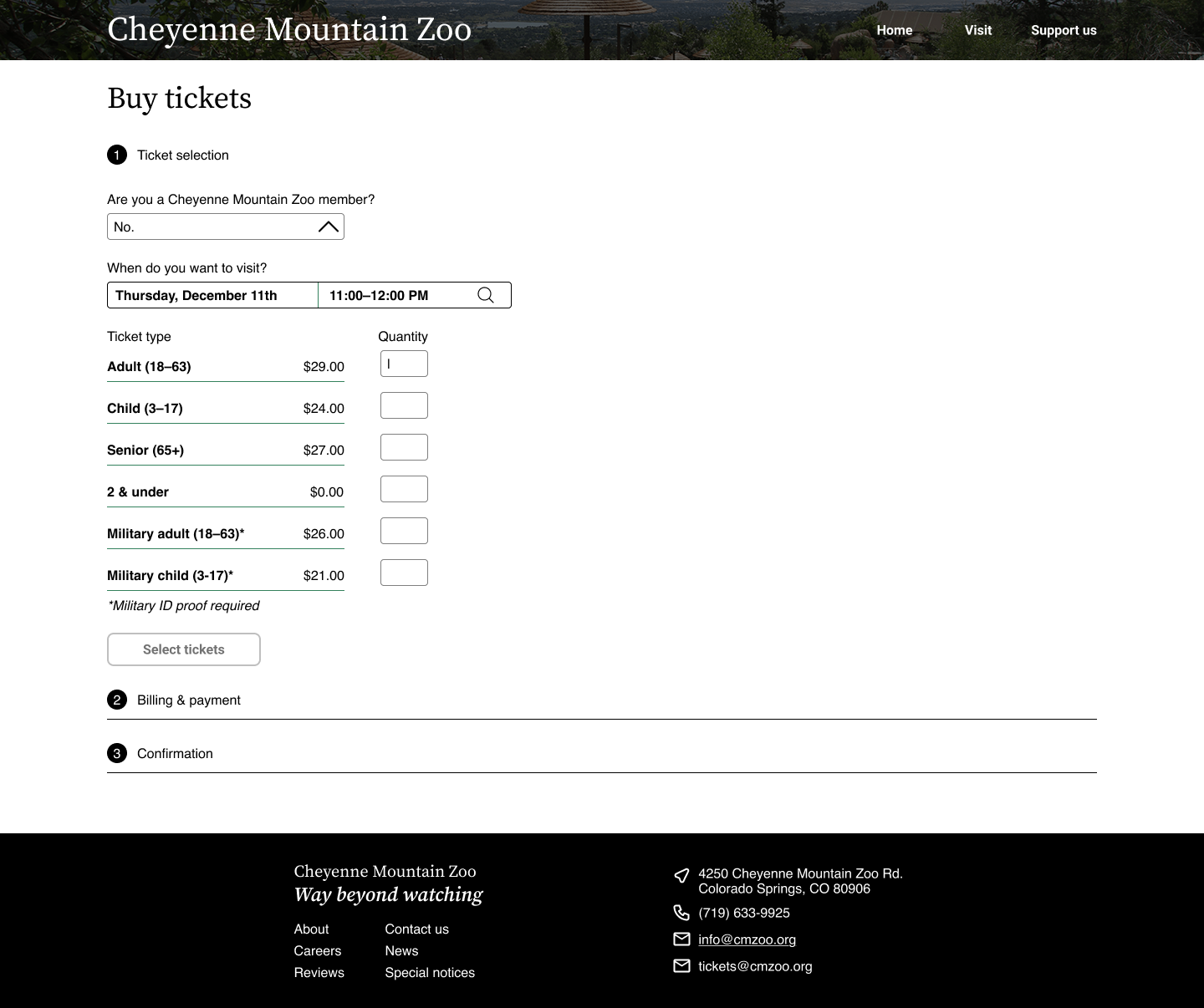
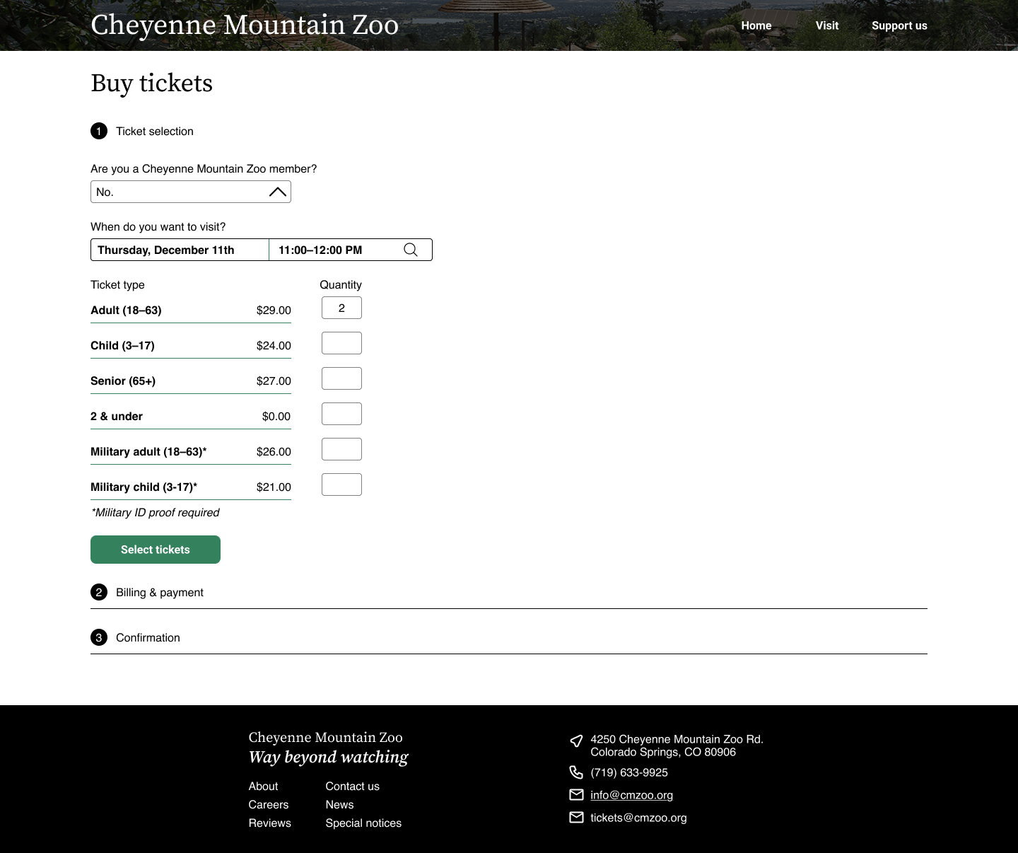
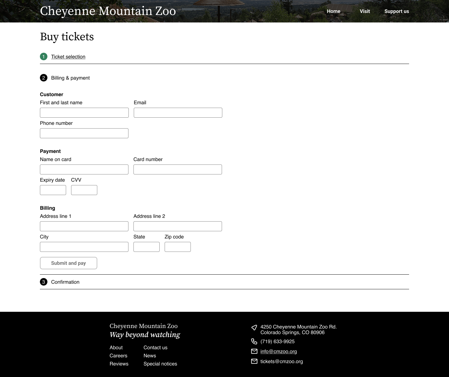
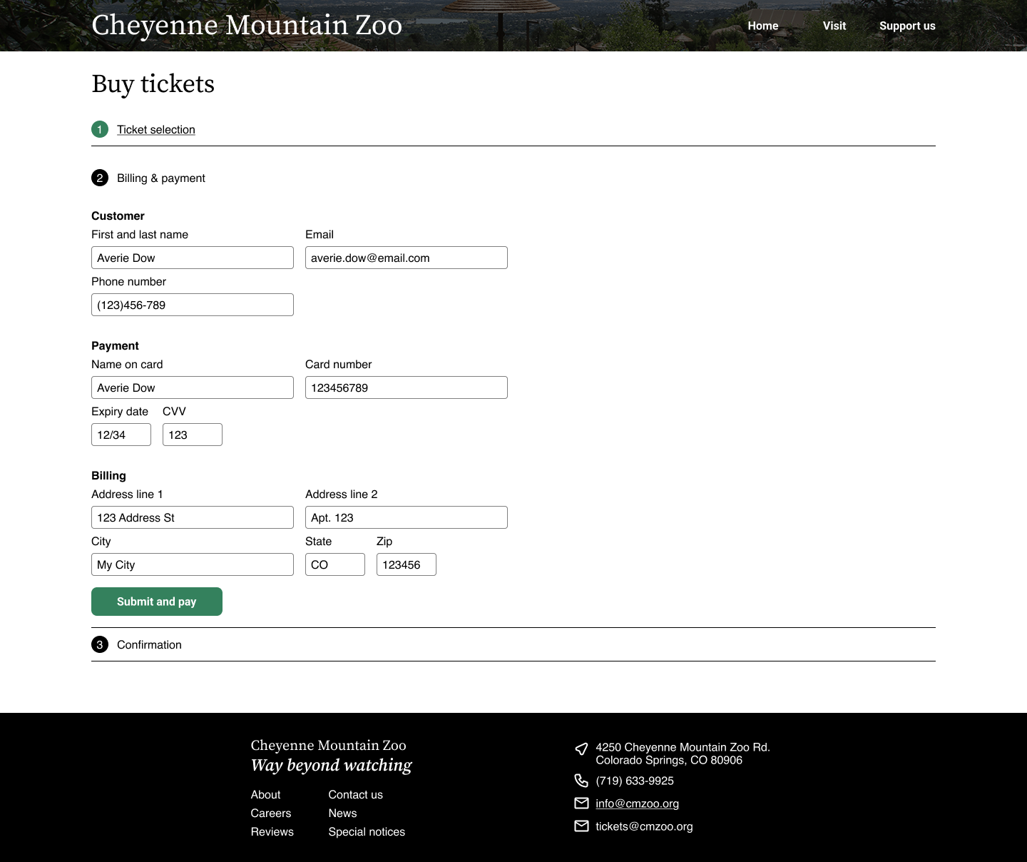
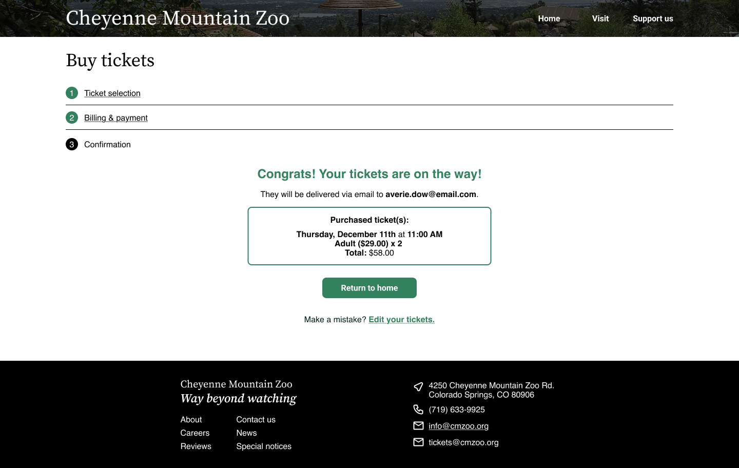
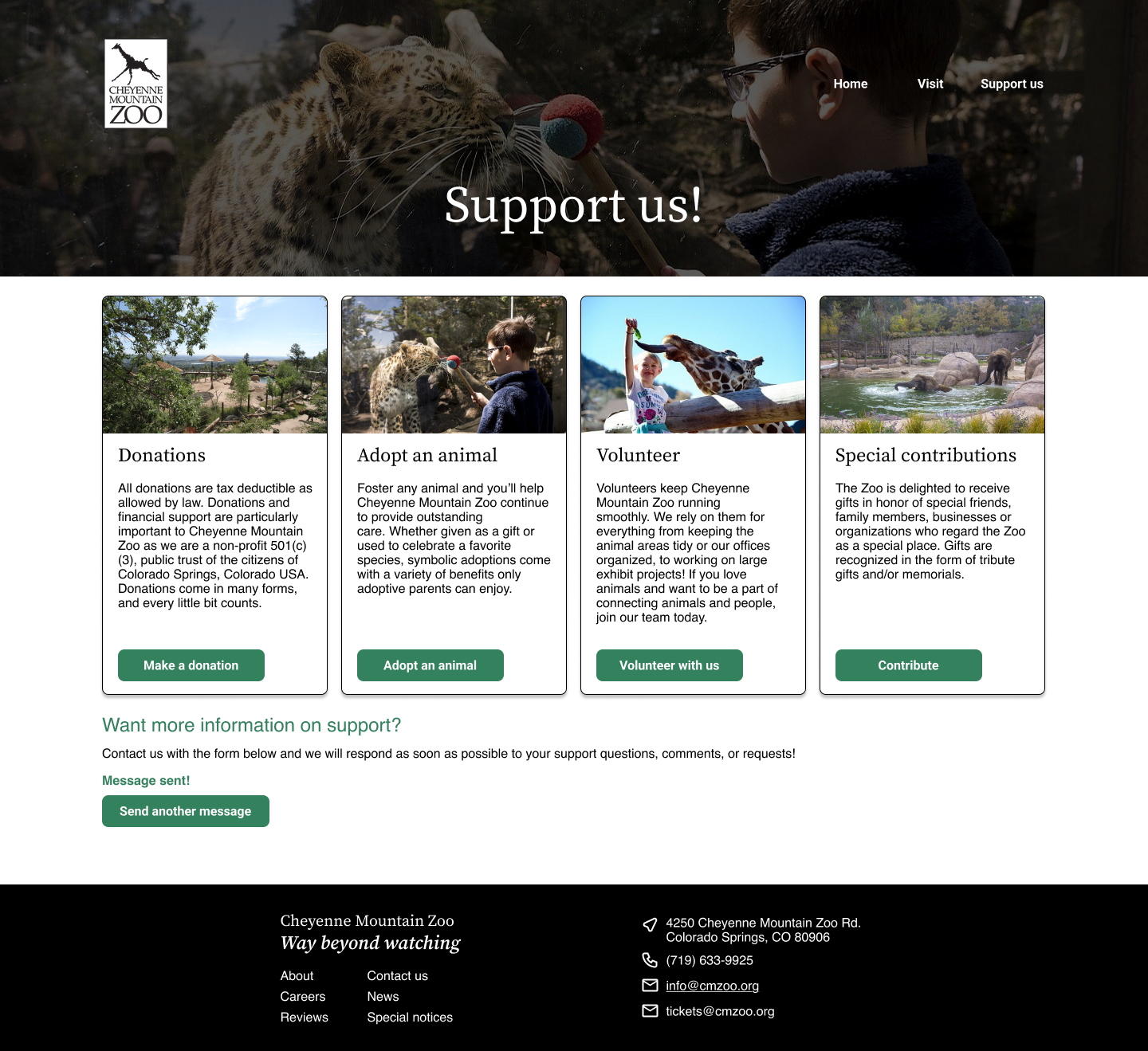
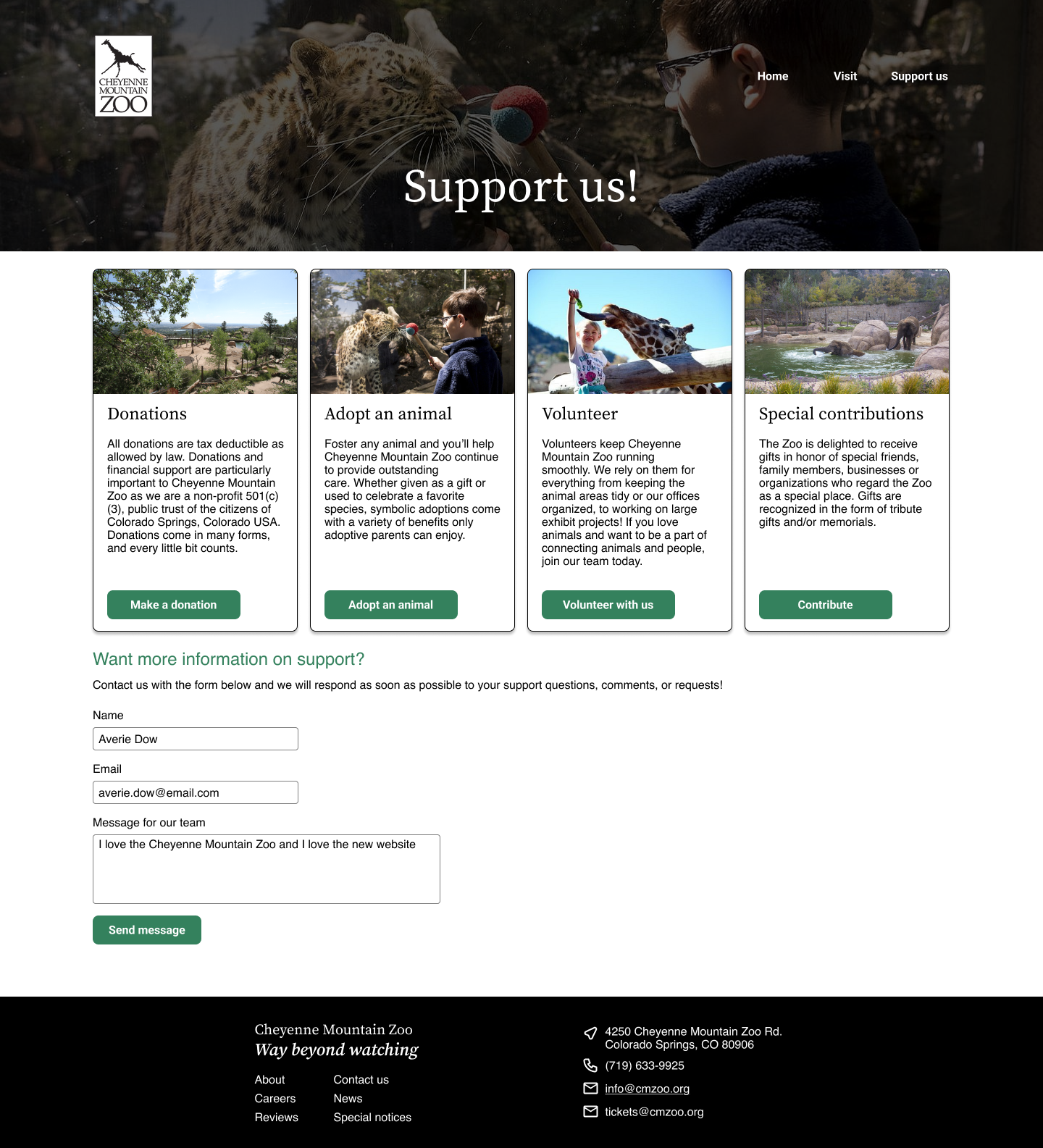
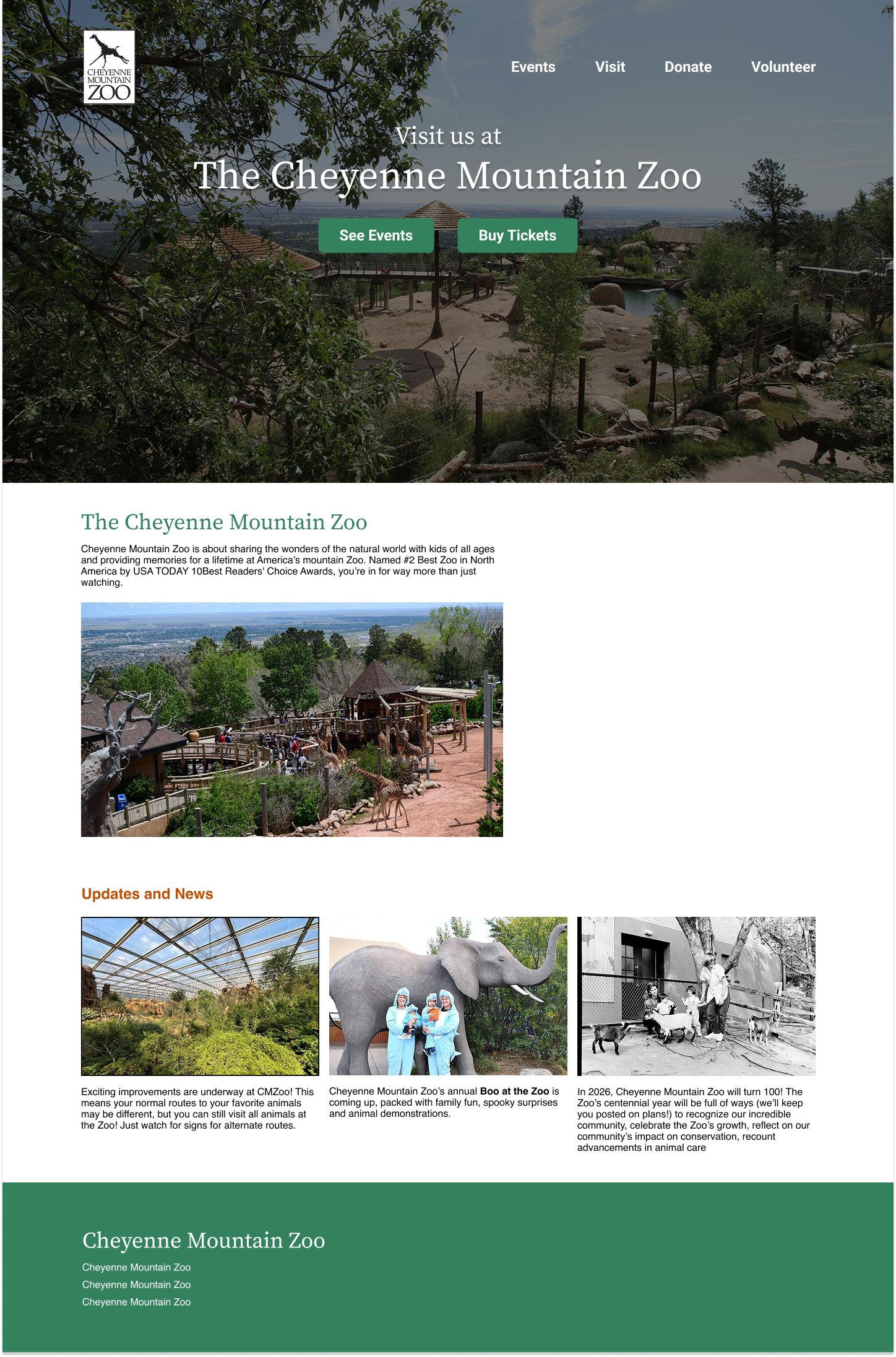
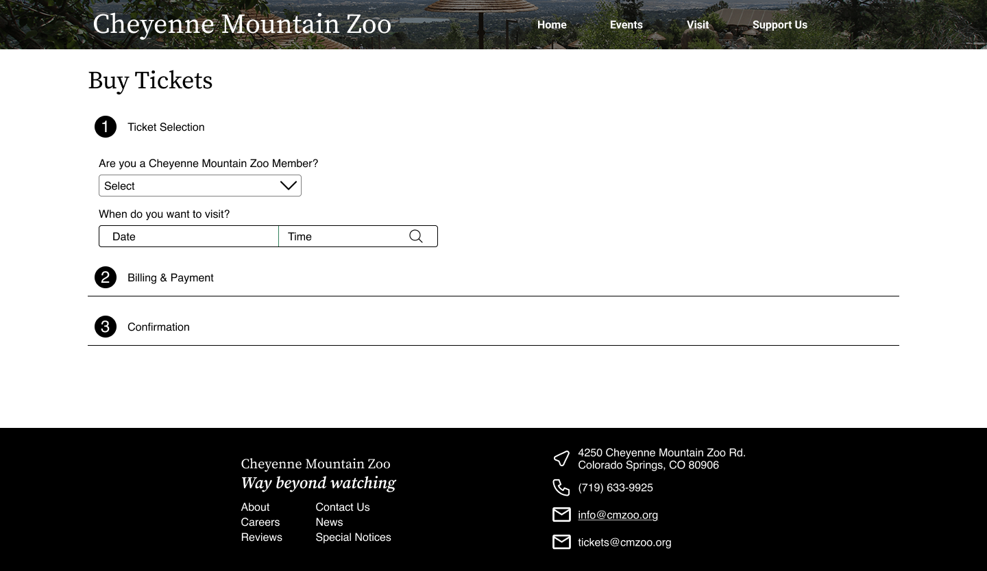
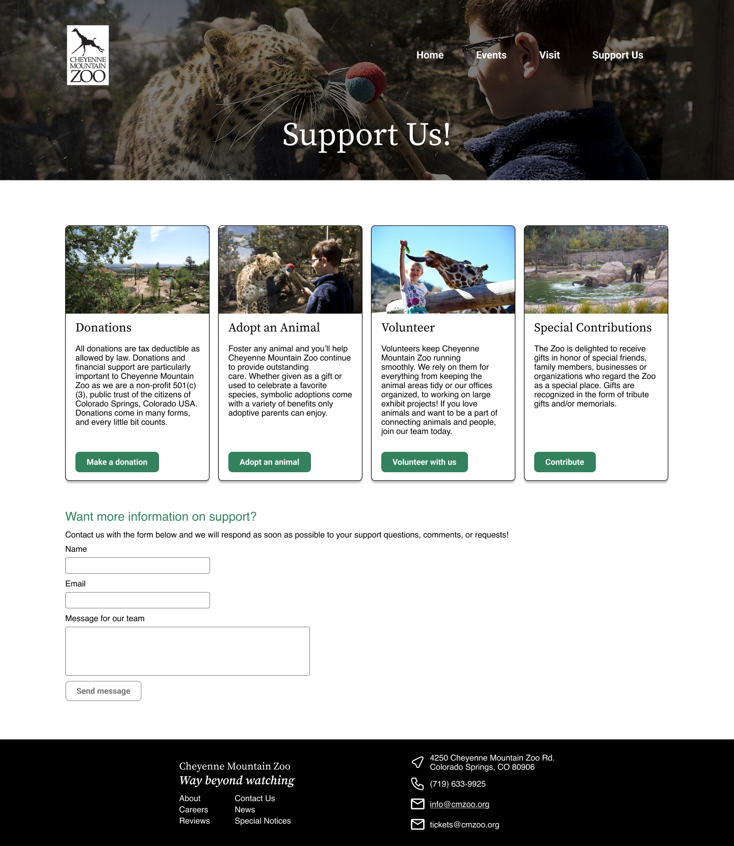
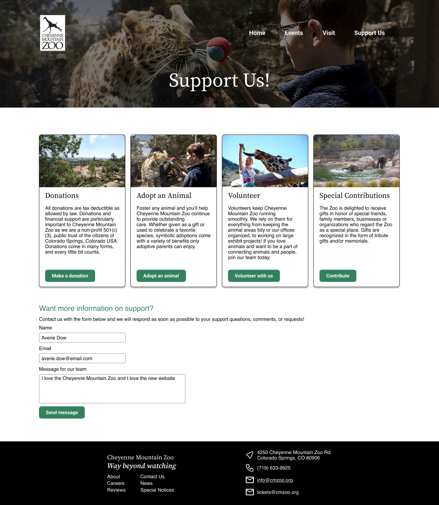
After drafting my ideas on paper, I moved to mid-fidelity mockups in Figma. I created a small design system and a rough brand identity for the website, aiming to keep it as true to their current branding as possible (within aesthetic reasons). I solidified the ticket purchasing process into one ‘Buy Tickets’ page with expanding panels to keep the users moving forward in the process, but also orient them within their progress of purchasing tickets. This way, they can see how one piece of information flows into the next.
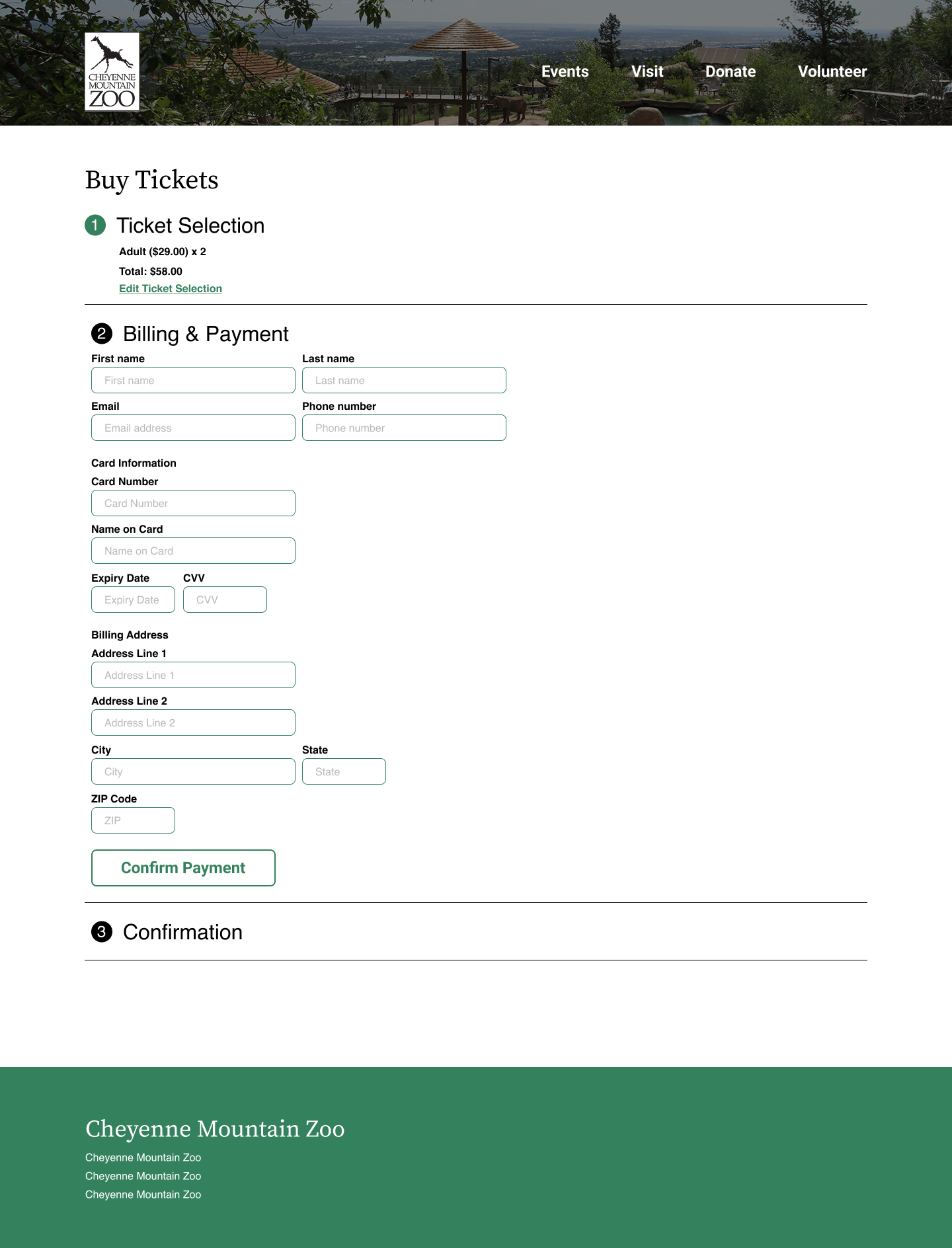
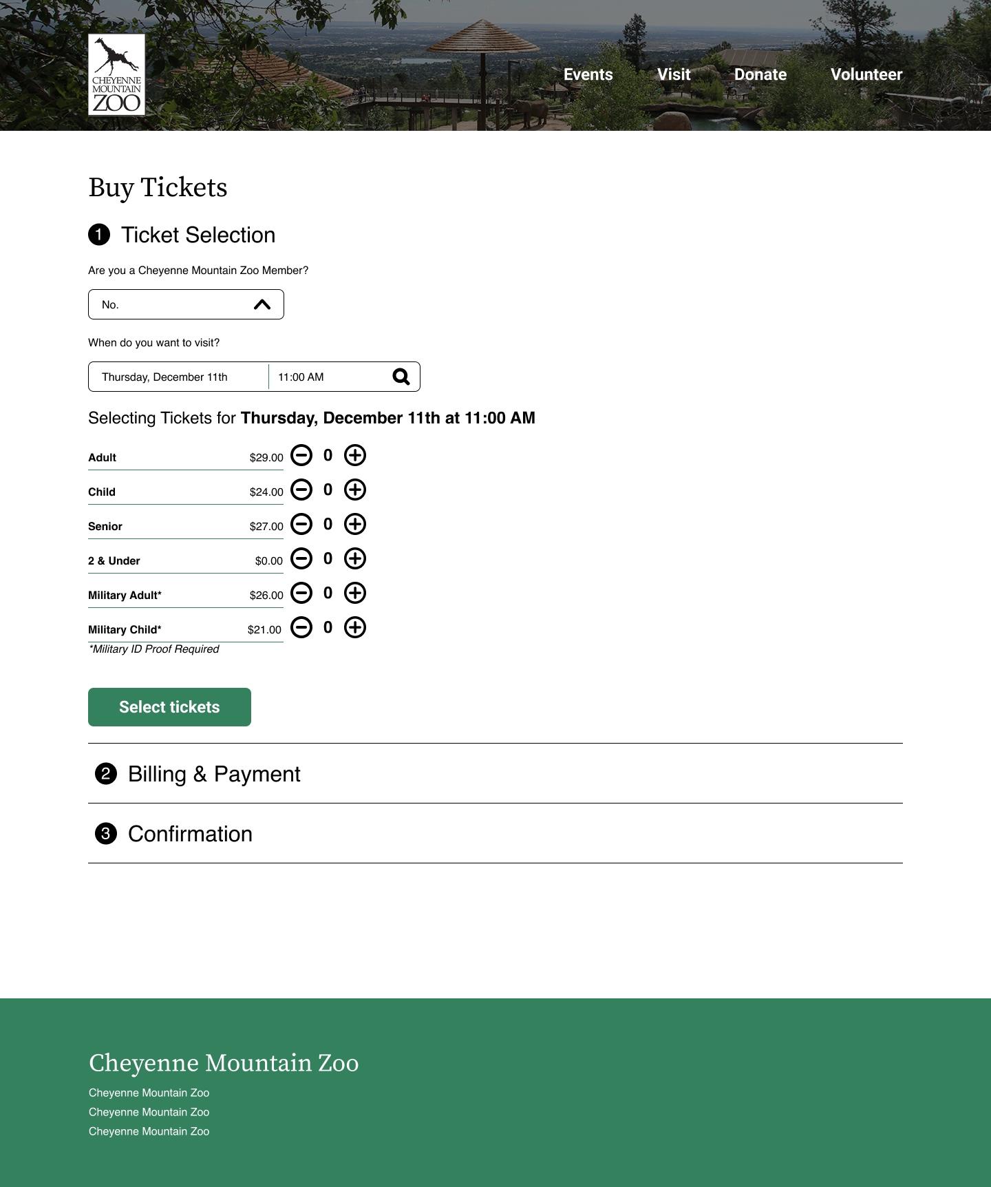
Moving from mid-fidelity and discussing different approaches with my peers, I created an interactive Figma prototype to imagine the potential interaction my design might have and identify any weird design patterns before my final prototype. Between Version 1 and Version 2, I received instructor feedback. The majority of this feedback was layout-related, as it was my first time working with the Figma grid (we never use it at OIT). I made these tweaks and completed my V1 prototype for more user testing.
High Fidelity V1
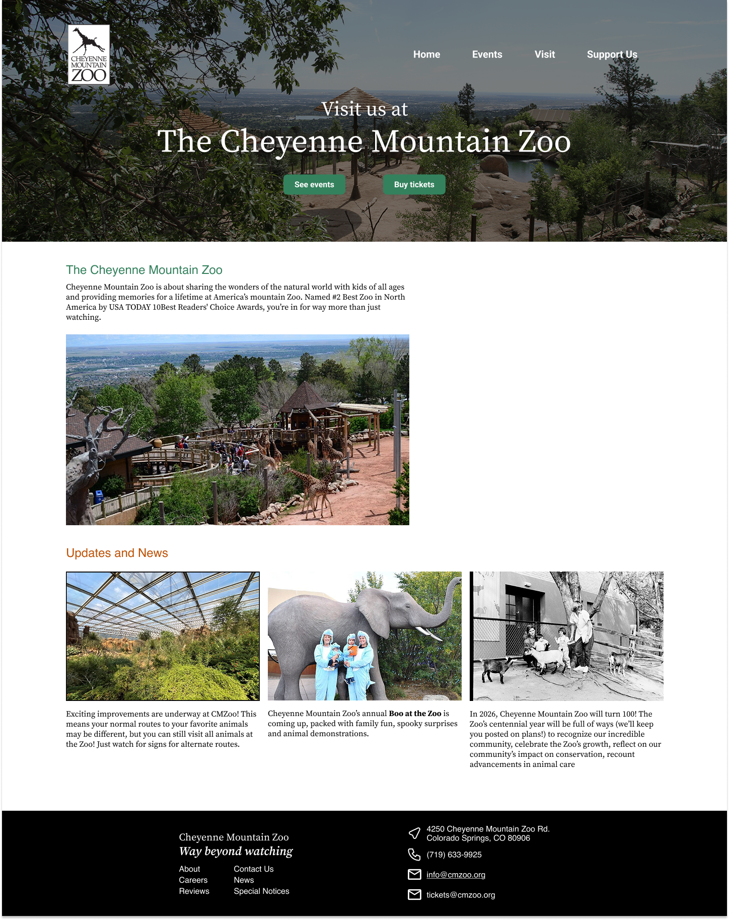

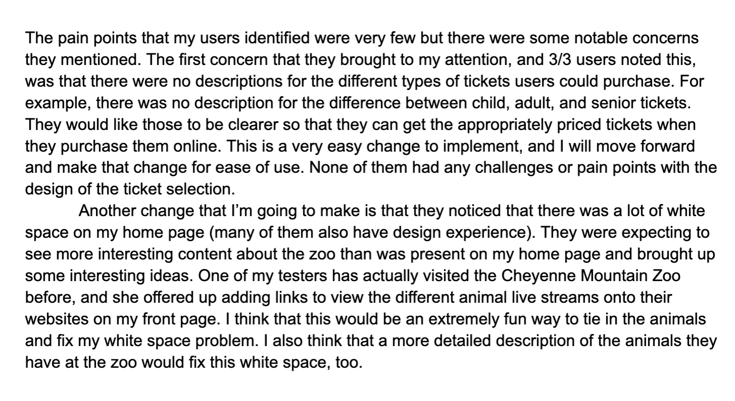
After creating my initial V1 version of the Cheyenne Mountain Zoo redesign, I conducted more usability testing with three users. The usability testing followed the same methodology as the first. I would guide my users through the websites with a series of tests and identify any pain points. The majority of the pain points they identified were aesthetics-based, including too much white space on the home page and a lack of clarity on the age ranges for different tickets. These were easy goals to accomplish for Version 2.
User testing
Age ranges aren’t clear between different ticket types
How old is young enough to be an Adult and not a Senior?
The home page does not feel like it has enough information on it
One user suggested adding a link to the live giraffe cameras.
Another user suggested adding an event calendar.
pain points:
Added clear age ranges for each ticket type
Ex: Child (3-17)
Added a link to the giraffe camera on the front page and moved the description of the zoo to the hero image to minimize overload on the front page.
Changes:
Usability test synthesis
Final High Fidelity Prototype
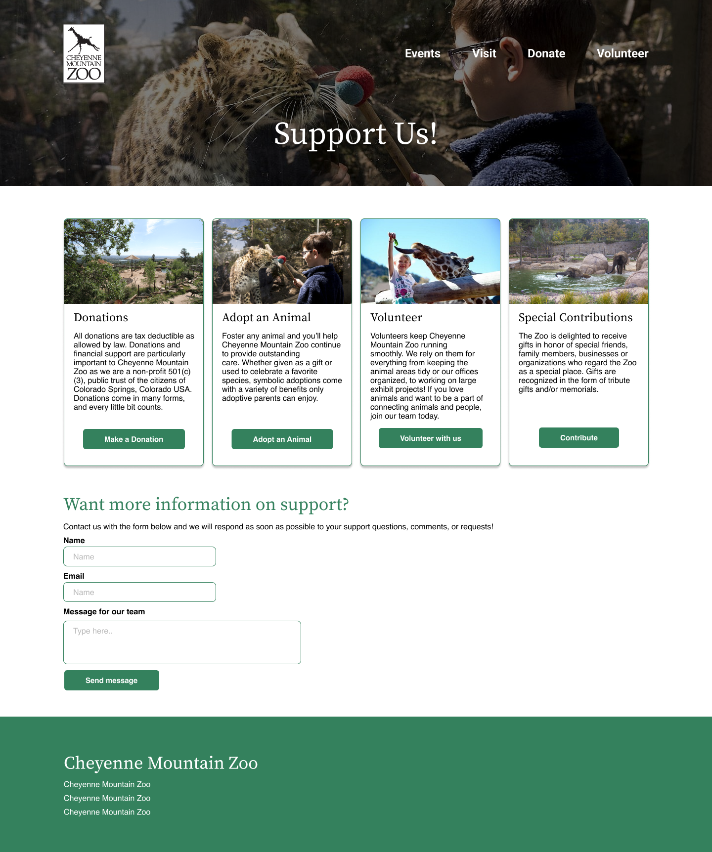
If I had more time to complete this redesign, I would love to redesign the pages that include information for visiting, like parking and weather protocols. I feel like that would rely heavily on UX copywriting, which wasn’t a huge part of this project.
Future Plans
Oftentimes, the coolest or most creative option is the least usable. The cute penguin animations on this site are fun, but they only contributed to the poor UX.
The information architecture of purchasing needs to be familiar to users to navigate it appropriately. When I had more intricate purchasing processes, my users found them harder to use.
Design is all about iterating and updating! I’m sure this website designer has some tweaks they would make to their design now :)
Takeaways